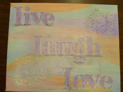
I usually pride myself on being really good at choosing my colors and having an idea in my head to go on. This latest canvas started out with an idea, but quickly spiraled out of control and ended up being one of the most messed up pieces I have ever done. I kid you not, it was just awful. Just take a look at the before and after pics and I will explain the journey:
Now you see why I refer to the first one as a disaster...It was just sooooooo wrong on so many levels! My first mistake: using pastel colors. Since when am I a pastel kinda chick? I should've known that it was already headed in the wrong direction...Then I added the lettering with molding paste. Once it was dry I used some twinkling H2O's, but as you can see, it was a very stark contrast (and I was starting to really feel uncomfortable with what it was turning into). Then I decided that outlining the words would help. I then chose black (seriously?! what was I thinking?). Then when it still felt horribly wrong, I thought maybe I would try some drippage (with India ink?! geez...I think I was channeling Halloween). Have I mentioned that the entire time I kept saying to myself, "maybe it's really not as bad as I think it is...maybe my friends will reassure me that I am just being picky and being my own worst critic again". So I turned it around and showed the girlfriends I was sitting with (we were at an all-day crop in October). My sweet friend, Carla, took one look at it and said, "Oh, honey. Just no!" She confirmed my thoughts exactly! Then my other friend, Karin, said, "Live, laugh, love...and bleed!" Oh my goodness! LOL! The giggles that ensued after this were insane. I do not remember the last time I laughed so hard I could barely breathe! Carla, Karin and Linda (who I was sitting with) have always been very encouraging of my projects and scrapbook pages, but we all agreed 100% that this canvas did not convey the sentiment on it at all!!!
So here is the first canvas again:
Goodbye Silks, Twinkling H2O's, India Ink, and silver glitter paste...time for gesso:
I am very thankful that Carla said I should take a pic of the first version so that I could show that anything can be fixed. I really wasn't sure if I could salvage this, but the final version has made me a believer in gesso being a great way to start fresh:
The first thing I did was change the glitter paste to blue. Then I took some modeling cream and smeared it in a few spots and then pushed a stencil against it for some texture. Once dried, I went to my trusty Dylusions ink sprays. Voilà! This makes me happy!! I love color and this was much more natural for me to do (it came together so fast once I just went back to what I love ~ color!). I learned a valuable lesson: I need to work with colors I love, not the colors I think others will love. I painted a bit of acrylic paint on the letters to make them lighter so that they would stand out. I did not want them stark white, so the fact that it reacted with the colors underneath was perfect. Now I can give this to the people it was originally meant to go to. A little piece of me with a nice message for them :)


